
Upsell Analytics: Dashboard & Reports
Bold Upsell provides comprehensive analytics to help you understand how your offers are performing on your storefront. You can track views, monitor products added to carts, and analyze purchases to optimize your upsell and cross-sell strategies. This guide details the metrics available on your Upsell Dashboard and within the Reports section.
Accessing your analytics
You can find your Dashboard metrics on the Bold Upsell home page. For more detailed insights, select Reports from the navigation menu.
Note: You must be on the Standard plan or higher to view the Reports page.
Dashboard metrics
Your Upsell Dashboard provides a high-level overview of your offers' performance over a selected period. You can manually adjust the reporting date range in the top-right corner of the Dashboard to view data from the last 7 days, 30 days, month-to-date, year-to-date, or a custom range.
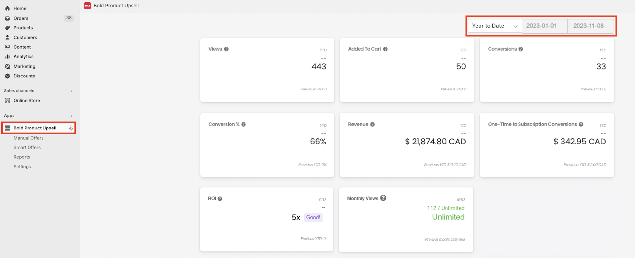
Here's a breakdown of the key metrics you'll find:
Views: Each time an offer is presented to a customer, it counts as a view, regardless of acceptance. For funnel offers, each offer shown within the funnel is counted individually.
Example: If a 3-offer funnel is shown and the customer views all three, it counts as three views on the dashboard. The entire funnel, however, counts as only one view towards your plan's view limit.
Added To Cart: This metric tracks when a customer adds a product from an Upsell offer to their cart. This is calculated on a per-offer, per-product basis.
Example: If an offer contains three products and the customer adds all three, it counts as three Added to Cart events.
Conversions: A conversion is counted each time a customer checks out with a product from an Upsell offer. Similar to Added to Cart, this is calculated on a per-offer, per-product basis.
Example: If a customer accepts two products from different upsell offers and checks out with both, it counts as two conversions.
Conversion %: This is the percentage of customers who added an offer product to their cart and then purchased that offer product. This is calculated using the Conversion and Added to Cart metrics. Formula: (Conversions / Added to Cart) * 100
Revenue: The total value of purchased offer products. Only items that are converted through the checkout contribute to revenue.
Example: If a customer has two $10 offer products in their cart but only checks out with one, $10 in revenue is calculated.
One-Time to Subscription Conversions: This metric reflects the revenue earned when a subscription is upsold through the upsell modal. Please visit Upsell & Bold Subscriptions Integration for more details.
ROI: Your total revenue divided by your Bold Upsell subscription fee. Formula: Total Revenue / Monthly Plan Cost.
Monthly Views: Your current number of views in the month compared to your Bold Upsell monthly view limit.
Smart Offers Statistics
Smart Offers provide their own distinct statistics to help you track their performance.
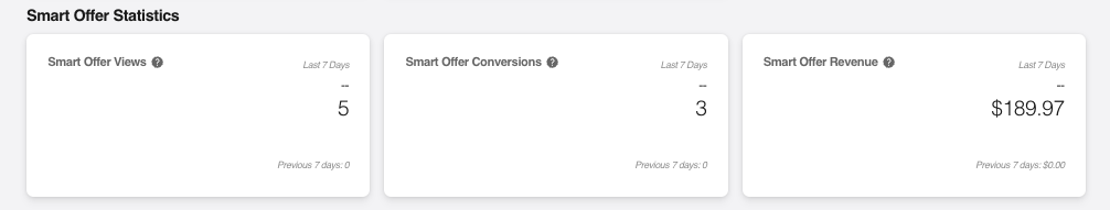
Smart Offer Views: The number of times a Smart Offer has been viewed.
Smart Offer Conversions: The number of Smart Offers that have been purchased.
Smart Offer Revenue: The total revenue generated by your Smart Offers.
Revenue By Location
This section provides granular information on the revenue generated by each of your offer trigger locations based on your selected date range.
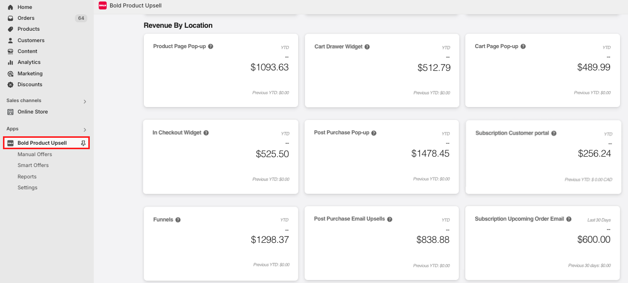
Product Page Pop-up: The total revenue earned from all Product Page Pop-up offers during the selected date range.
Cart Drawer Widget: The total revenue earned from all Cart Drawer Widget offers during the selected date range.
Cart Page Pop-up: The total revenue earned from all Cart Page Pop-up offers during the selected date range.
In Checkout Widget: The total revenue earned from all In Checkout Widget offers during the selected date range.
Post Purchase Pop-up: The total revenue earned from all Post Purchase Pop-up offers during the selected date range.
Subscription Customer Portal: The total revenue earned from all Subscription Customer Portal offers during the selected date range.
Funnels: The total revenue earned from all funnel offers during the selected date range.
Post Purchase Email Upsells: The total revenue earned from all Post Purchase Email Upsells during the selected date range.
Subscription Upcoming Order Email: The total revenue earned from all Subscription Upcoming Order emails during the selected date range.
Reports
The Reports section offers in-depth analytics, providing real-time statistics and historical data through tables and charts. You can find reporting data for each individual offer here.
All Upsell Offers report table
This table provides an overview of how all your offers are performing. Selecting an offer name will display more detailed statistics for that specific offer.
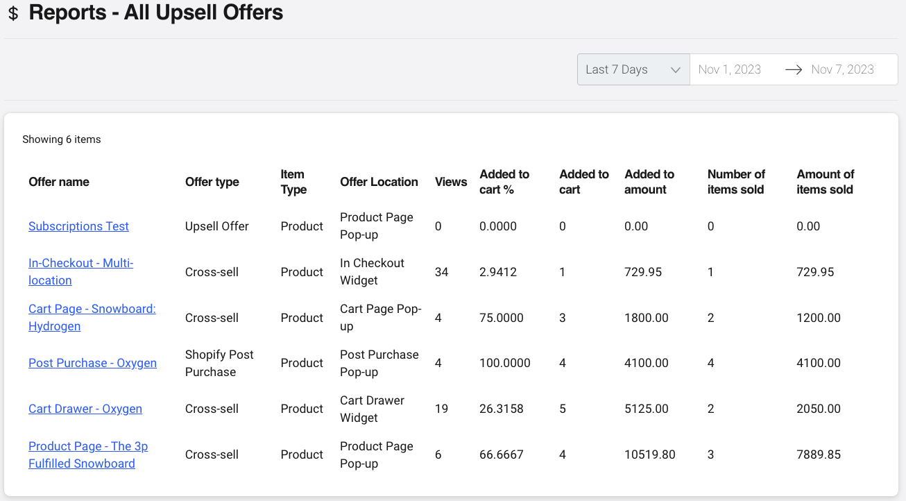
Offer name: The internal name of your offer.
Offer type: The type of offer that is displayed on the storefront.
Item Type: Indicates what each group is offering. Each group will either show Product (one-time product upsell/cross-sell) or Subscription (converting a one-time product to a subscription).
Offer Location: The Trigger location for each offer.
Views: How many times an offer was displayed to a customer.
Added to cart %: The percentage of customers that viewed your offer and added a product to their cart.
Added to cart: The number of times a customer has added a product to their cart from the offer.
Added to amount: The total value of the products that have been added to your customers' carts.
Number of items sold: The number of products from the offer that were purchased.
Amount of items sold: The total revenue earned from all successful purchases for each offer.
Graphs
The Reports section also provides visual representations of your data through pie and line charts, offering historical insights into your offer performance. You can download these charts in various formats (.PNG, .JPEG, .PDF, .SVG) using the hamburger menu icon.
Pie chart graph
This chart provides a breakdown of products purchased from your offers.
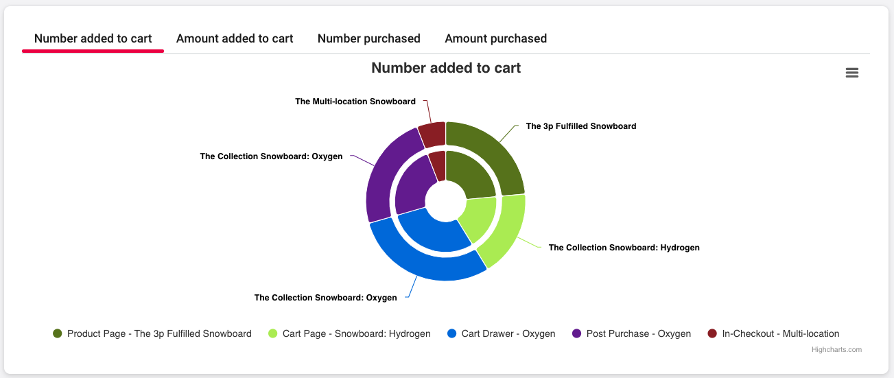
Number added to cart: Shows the percentages of each product customers added to their carts. The inner circle indicates the offer(s), and the outer circle represents the item(s) being added to the cart.
Amount added to cart: Displays the total value of the products that are being added to carts, in your store's default currency. The inner circle indicates the offer(s), and the outer circle represents the item(s) being added to cart.
Number purchased: Shows the percentages of each product customers have purchased from your offers. The inner circle indicates the offer(s), and the outer circle represents the item(s) being bought.
Amount purchased: Displays the total value of the products purchased from your offers. The inner circle indicates the offer(s), and the outer circle represents the item(s) being bought. These amounts display in the store's default currency.
Note: Products that no longer exist in your Shopify admin display as "Deleted Product". This can happen if you're using the Upsell and Bold Discounts integration to create BOGO offers, as items are removed when sales are turned off in Bold Discounts.
Line chart graph
This chart illustrates how your offers are converting over time.
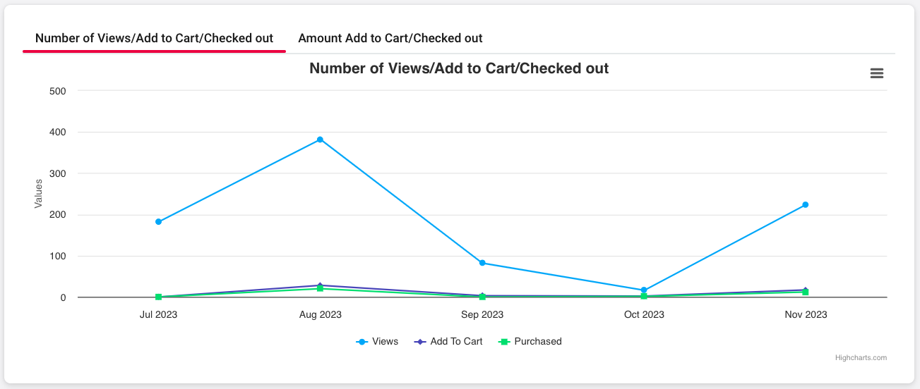
Number of Views/Add to Cart/Checked out: Shows the number of views your offers receive, how many times products are added to the cart, and the number of purchases in a given month.
Amount Add to cart vs. Checked out: Compares the value of products added to carts against the value of the items being purchased.
FAQs
Can I export report data from Upsell?
No, there is currently is not an export feature in Upsell at this time.
Can I see which orders that upsell or cross-sell offer products were added to in a report?
No, there isn't a report available to show which specific orders included an upsell or cross-sell product added by the customer.
Can I view reports with a custom start and end date?
Yes, you can use the date range selector on the Reports page, located near the top right corner.
Why are months missing in the Upsell Monthly report?
While using Upsell, you may find that the monthly report graph is missing months:
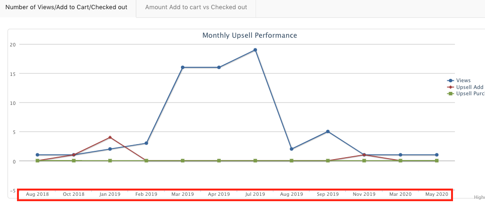
This can occur if the app is uninstalled and then reinstalled at a later time. Upsell cannot calculate reporting details during the time that the app is not present on the store.